Sunday, August 06, 2006


Pit Firing

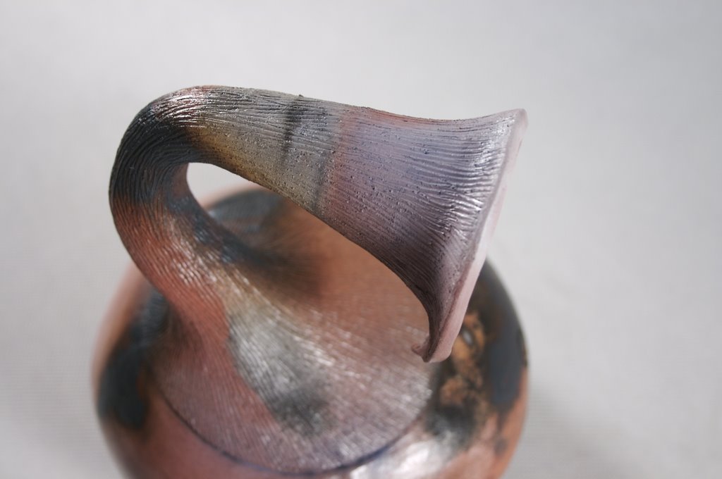
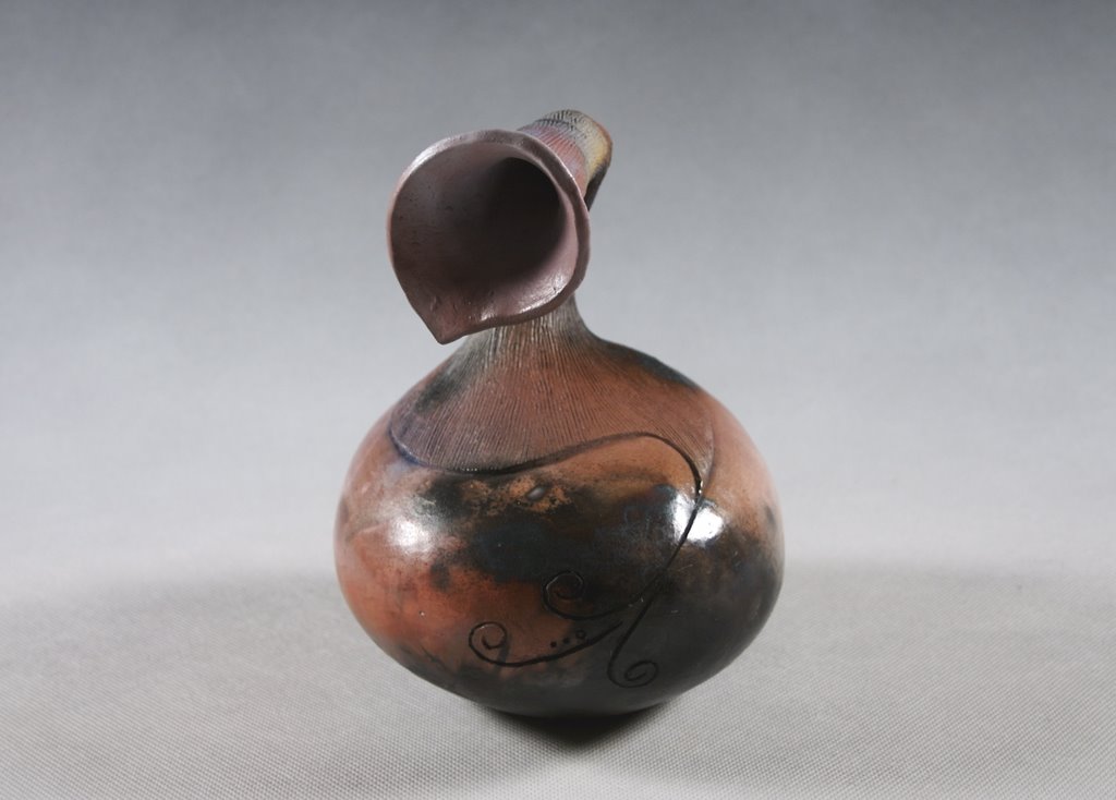
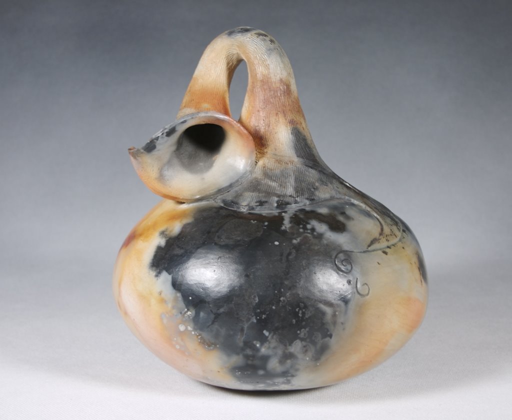
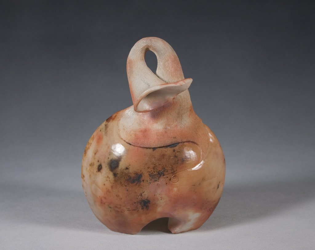
The primitive process of pit firing intrigues me. That a vessel can be decorated by the smoke and fumes generated in an everyday campfire is amazing. I love how unpredictable and spontaneous the surface is with flashes of random colors and textures.

Contemporary potters have many advantages over the ancient potters for whom pit firing was the only "firing" available. With an electric kiln, I am able to bisque fire pieces before pit firing, thus ensuring consistent hardness in the clay and saving me many breakage headaches. Also, there are many pure chemicals and minerals available from pottery suppliers which can be used to gain some predictability in coloring. For instance, Copper Carbonate, when sprinkled around pots, will give flashes of deep red to maroon and shades of pink. In the July/August issue of Pottery Making Illustrated, there is a chart that outlines some sources of color in barrel firing (very similar to pit firing) and their results (pg. 26).

There are as many different ways to pit fire as there are potters, but mine is uniquely adapted to my present circumstances. I fire in my In-law's backyard fire pit. It has a cement bottom and fairly large stones around the edges. My In-laws live up in the hills and well away from neighbors so we haven't received any complaints for the fires yet (although we did have one concerned neighbor call worried that the house was on fire when he saw the smoke wafting up from behind it).

In order to transport my pots safely there, I first wrap them in individual bundles at home. The bundles are composed of copper scrubbing pads, banana peels, and newspaper. After painting my vessels with a half-water-half-ferric chloride mixture (Warning: ferric chloride makes beautiful colors, but must be handled with extreme care. Please read all warning labels and use proper protective materials when working with this substance) I place banana peels in strategic places on the pot and then tape or wrap cut-up copper pads on top of that. The messy pot is then wrapped in newspaper, which has the double advantage of cushioning the pot for the journey and increasing flammability around the pot in the fire.

At the firing pit, I first lay at least an inch of wood chips. On top of the wood chips is a fine layer of straw or hay that serves as a bed for the pots. A liberal sprinkling of rock salt, copper carbonate, and red iron oxide is given to the hay. The pots are placed with the largest ones in the middle and the smaller ones radiating out in a circle. I rarely stack vessels unless lack of space forces me to. I scatter more straw/hay on top of and filling in gaps between vessels and then sprinkle more of the minerals on top . From this, I begin to place firewood around the pieces, with small kindling first and then larger logs around the outside and stacked in the middle. Newspaper strips are tucked in between logs to get the fire going. The whole thing gets a very liberal spraying of fire starter, and then I drop in some lit matches. Then I just let the fire burn until dead--which usually ends up being a couple of hours.

After the fire has burned itself out, I use metal tongs to pull out the sometimes still hot pots and place them on the stones around the pit to cool. Once they are cool enough to touch, I use an old rag to wipe of the ashes and then wrap them in newspaper again and box them up for the trip home.

To finish the pieces, I thoroughly clean off the remaining grime from the fire with a lightly damp rag. I use Future floor finish diluted half-and-half with water to seal and polish the vessels. It is an acrylic finish, so it serves to seal and make the vessels more durable, as well as giving a slight sheen to the surface.

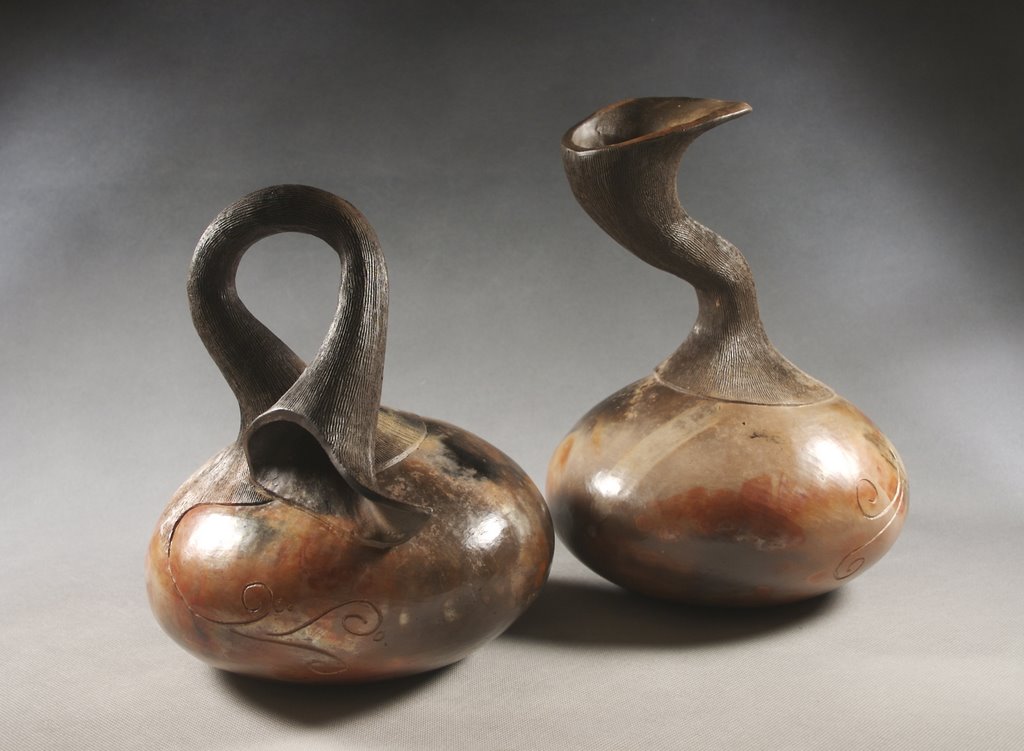
Above and Below are pictures of vessels from the last pit firing on 8/3/06
Tuesday, August 01, 2006


Saggar Fire Research Project
Clay Arts Utah is sponsoring a Saggar Fire Research Project. Every week, anyone from Clay Arts Utah may bring and fire a clay saggar for free at the Pioneer Craft House and Farmers' Market. The only requirement is that the artist bring a list of the ingredients that went into the saggar. Different temperatures and holding times are being tested. Even children that come to the farmers' market may get involved by putting together mini saggars. Results from each firing are photographed and posted on the Clay Arts, Utah website.

The exciting thing about this program is that all of the experimental information will be pooled. Artists can compare all of the firings to see which combustibles actually created which variables in color within the saggar and at what temperatures. Also, individual artists get to try new combinations every week without wracking up an enormous gas bill. In this last firing, I tested a wash of cobalt carbonate on the pot and got some very interesting pale blues, green/grays, and pinks (see pictures above and below). This project will be continuing all summer and throughout September. I'm very excited to see what fires up!


Thursday, May 25, 2006


Selling my Work
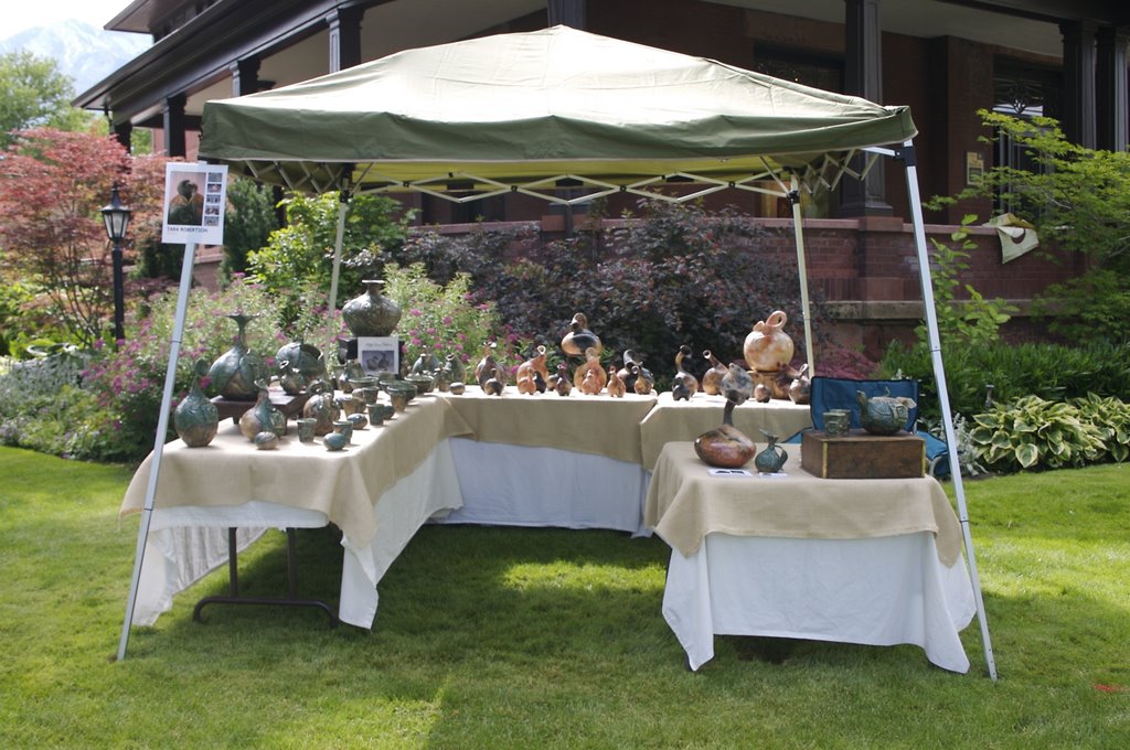
Last weekend, I participated in my first outdoor sales event. It was amazing how much stuff I needed to pull together just to be prepared to sell. Here were some of my biggest considerations:

Payment Options
In this day and age, it's not only getting outdated, but also risky to accept personal checks. I wanted to first: find out how to cover my butt if things went to small claims court, and second: find a way of accepting credit cards from a remote location. The solution to the first problem was to avoid checks if possible, or if not possible, to get as much information about my buyer in writing as possible. I looked closely at the check and some ID--made sure that names and addresses matched up. Also, I looked at the check number. Had this person been using this account long? As far as credit cards go, I found a great solution for me in PayPal's Virtual Terminal. PayPal charged $20 a month and a small percentage fee of each transaction. The Virtual Terminal was accessed from my personal computer and funds went directly into my PayPal account, which I later transferred to my bank account. With a small, plastic credit card imprinter (I got mine at POSPaper online), cards could be imprinted and receipts created while at the outdoor function. These receipts were keyed in later on the Virtual Terminal.

Booth Design
I had to just bite the bullet and buy a canopy for my booth. Most of the other things for my display were borrowed from other family members. I borrowed two 6-foot tables and several wooden boxes and wire stands from my in-laws' house. I had two smaller card tables of my own. For tablecloths, I used old white sheets covered by burlap that I bought by the yard from a fabric store.


Advertising/Professionalism
After creating a few informational signs on my computer, I printed them off and laminated them at Kinko’s. I designed business cards and flyers using a Microsoft Word template for the cards and Pages for the flyer. I printed the business cards at Kinko’s, but made the flyers black and white and printed them at home on cardstock.

Pricing/Inventory
It was a surprise to me, but this part of the whole process actually took the most time. Having not sold in this sort of event before, I was unsure how to price my items. I needed a good record of my pricing, and what sold and what did not. On Microsoft Word, I created an inventory sheet and then spent several hours filling (and re-filling and refilling--as I changed my mind about prices) it in.

Packaging for Sales
Something I had not really thought about before was what to do with the piece after the customer decides to buy it. I ended up buying some brown paper bags bulk and a roll of craft paper to wrap the pieces in.


Results
Customer turnout at the show was not nearly what we had hoped. After spending more money than I care to admit on all of the considerations above, I think I about broke even with my sales--maybe a little less. However, there were some very nice bonuses. I started a mailing list of customers who enjoy my work and got my information out there to potential buyers. I now have all of the supplies to put together a booth for another sale. I am also prepared physically and emotionally to sell again. What I treasure most is the valuable ideas and information that came from spending time with other experienced potters.

Wednesday, May 17, 2006

Finding Inspiration in Motherhood

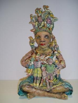
Janis Mars Wunderlich is an artist who derives inspiration from her role as a mother. I recently read a short article in this month's Ceramics Monthly about her solo exhibition at Sherrie Gallerie in Columbus, Ohio.

I was really impressed by Wunderlich's use of her children as a creative theme.
Of her work, she says, "My recent work explores the idea of 'accessorizing' with children. Sometimes I feel as though my wardrobe consists of kids from head to toe. Instead of artsy or fancy accessories and jewelry, I have children hanging from my ears, neck, and arms! In a sense, the mother figure seems hidden or lost behind all the clingy creatures. But in reality, she is strengthened, clothed and made beautiful by them. They give her layers, textures, identity."

In today's world, where many look down upon women who make the choice to stay at home with their children, I find Wunderlichs unabashed pride at being a mother very encouraging. Instead of "giving up" a career outside of my home, I am gaining "layers, textures, and identity" and can use my experience as a source of insight and inspiration.

Wunderlich describes with almost humorous accuracy through her art what it is to be both a parent and an artist. In her own words, "My children inspire me with both their imaginative minds and animal-like energy. But parenting is physically and emotionally demanding! The tantrums, messy diapers and adolescent "sassiness" are emotionally draining."


Janis Mars Wunderlich, "Six Swans"

Monday, April 24, 2006

Tin Foil Saggar

Historically, saggars were used to protect glazes and wares from the open flame, gases, and ash inherent in the process of wood-firing. This technique was used in ancient China, Korea, Japan, and even the later industrial potteries of Great Brittain. The name itself derives from a contraction of "safeguard". Saggars were constructed of large clay jars or brick boxes placed inside the kiln.

Contemporary potters use saggars in a way completely opposite to the original use intended. Instead of placing a pot in an empty saggar for protection, potters intentionally fill it up with all kinds of "gunk". Organic materials, such as banana peels, cat food, leaves, and twigs can be attached to the vessel with copper wire, masking tape, steel wool, etc. This concoction can be further covered with sawdust, salt, baking soda, copper carbonate, red iron oxide, newspaper-- you name it. The possibilities are endless with any number of the ingredients listed above as well as a myriad of other choices.

I was taught to saggar fire in an outdoor raku kiln by applying some of the above ingredients and then wrapping the entire thing in tin foil. The pots were fired until they "looked right" (about 1400 degrees) at which point they were pulled out, unwrapped, and put in water to cool.

When reintroduced to saggar at another college, I found that the method practiced was completely different. Pots were still wrapped in combustibles and organic material, but then they were wrapped in a newspaper bundle. This bundle was then loaded in a box built of firebrick inside an outdoor gas kiln. The space around the pots was filled with pine needles, sawdust, salt, copper sulfate, and red iron oxide and sealed on top with a kiln shelf. This was fired to between 1600 and 1799 degrees and allowed to cool for several days before emptying.

Intrigued by the difference in techniques and the range of possibilites, I started researching saggar firing. I found some great online resouces in Wanda Garrity , who was quick to answer my questions about her techniques through emails, Dick Lehman's site, which has a good article about a method for getting carbon imprints, and Pitfire, Matt Hoogland's personal website that has a lot of information about saggars and terra sigilata. Barrel, Pit, and Saggar Firing by Sumi Von Dassow has been a great reading resource. It is a collection of Ceramics Monthly Articles about the topic. Another good read, which was reccomended to me by Wanda Garrity, is Alternative Kilns & Firing Techniques.

Yesterday, I tested out a new method (to me--I'm sure someone, somewhere has done it before) created from a combination of past experience and reading.
After painting on a layer of ferric chloride, I wrapped my pots in organics (ok, so I cleaned out my fridge and ended up using moldy peppers and broccoli), copper scrubbing pads, and sawdust with a pinch of salt and some copper carbonate. This package was then wrapped in tin foil with the shiny side out. All of the tin foil packs were tumble-stacked in my electric kiln and fired to cone 18--about 1390 degrees.

The results were not what I had expected. The sawdust only blackened the ware where there was a lot of it in intimate contact. The organics and copper scrubbers burned out a pale orange/pink. For the next firing, I think that I will use more sawdust in more concentrated areas. Also, right after firing, I read in
Alternative Kilns & Firing Techniques that salt can corrode the elements in an electric kiln. So, no more salt in the next firing--I'm lucky that I didn't put much in the last one. But copper carbonate, red iron oxide, and other colorants are still fair game. I'm also thinking of experimenting with pit firing in my inlaw's backyard (large) fire pit.

Below are two examples of saggar fired pots. The first was fired at the college lab in a gas kiln, the second was fired in my electric. To see more of my finished saggar pots, check out my website TRPottery.


Tuesday, April 18, 2006

Website!


I just published my very own website. It has pics of my recent work, more about me, and some of my favorite glazes. Check it out!

trpottery

Thursday, March 30, 2006

Glaze Development: Working towards an unknown goal

Glaze can literally make or break a pot. One of my ceramic teachers used to say that when a kiln gets opened, it’s either Christmas or Halloween. Because my kiln wouldn’t fire to glaze temperatures when I started my series, I was not able to even attempt glazing my works for a long time (see “What was wrong with my kiln”). I made a lot of bisque ware. With each pot, I improved my carving and texturing technique. I liked what the bisque ware looked like, but didn’t really know how to finish them off. I had a few basic ideas of what I wanted my glaze to look like. It should bring out the texture and carving on the pieces, incorporate a strong shade of green, and look old, like a worn down stain.

I had seen red iron oxide work well alone as a glaze. I wanted to get that same effect, only in green. I bought a ½ pound of Florentine Green Mason stain and ½ pound of Grass Green.

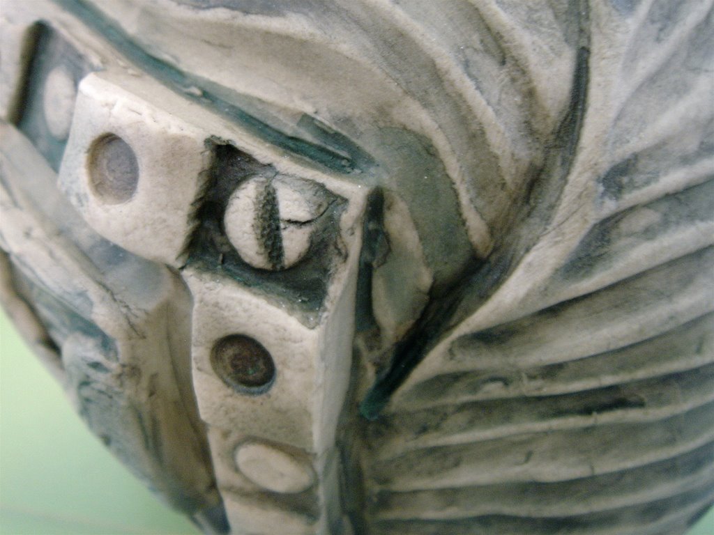
In my first attempt at glazing, I tried a watered down wash of Grass Green (straight up, no glaze added) with an even more watered down wash of Florentine. At cone 10, the Grass Green burnt out to light brown and the Florentine looked gray or a pale dark green. The two pots that I tried this out on were not very pretty. Below is a detail picture of one of the pots and a close-up of a test tile in the same load.


For my second try, I decided that the background needed some kind of contrast to make the pots more interesting. Also, the green needed to be--well, more green. I used red iron oxide in a wash on the background areas and a lot thicker wash of just Florentine on the leaves. When I opened up this glaze batch, I realized why the makers of mason stain advise using some sort of glaze or slip to attach their product to clay. The pots looked really dusty, as though they had been covered with chalk without a fixative (which I guess is pretty near to what happened). When I grabbed one to pull it out of the kiln, I realized that the finish didn’t just look dusty. I had green powder all over my hands. In an effort to salvage at least some of these pieces, I rinsed off most of the excess stain and then brushed a satin clear varnish over the whole pot. The effect was actually pretty good and is pictured below. Knowing I had something to fall back on if further attempts failed, I kept looking for better alternatives.


I went on the Internet and found a couple of cone 8-10 clear satin or matt glazes to try out at www.ceramicstoday.com. I ran a series of tests on these glazes with the colorants in hopes that at least one combination would work. I tested each glaze two different ways: (1) with a little glaze mixed into the colorant thinned with water, and (2) with the glaze brushed in a thin wash over the top of the bare colorant. I was looking for an aged, stained look, and so didn’t use very much glaze in the hopes that it would act as a fixative without being too glossy or overpowering. One of the combinations turned out pretty well. It was nearly what I was looking for, although the green could have been brighter still. The best results seemed to come from a thin wash of glaze over bare colorants.

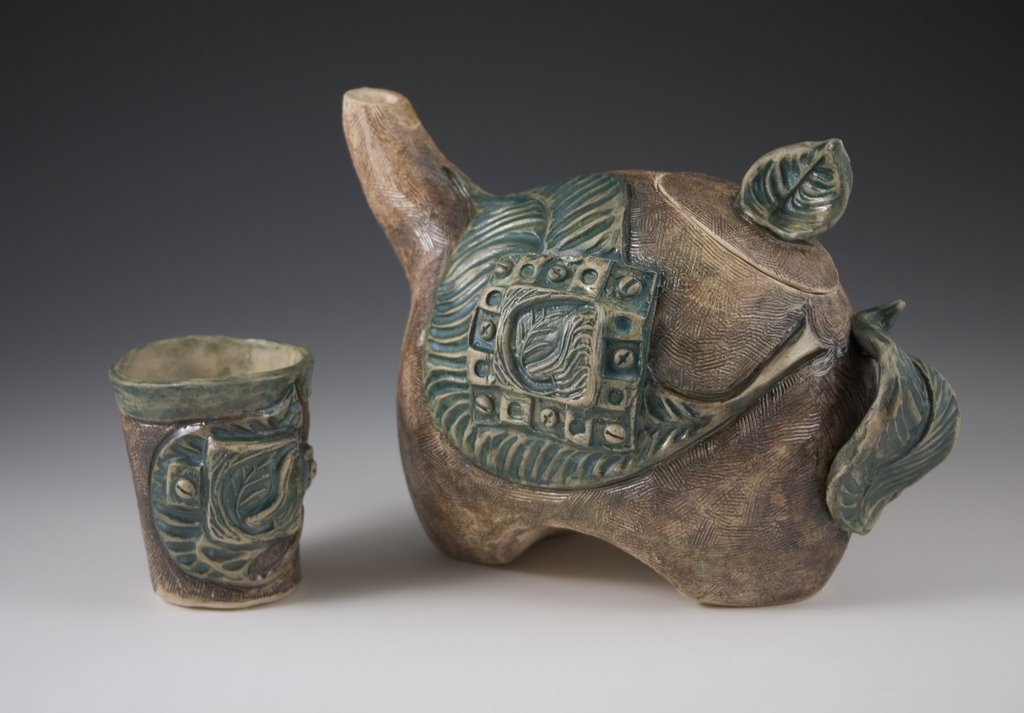
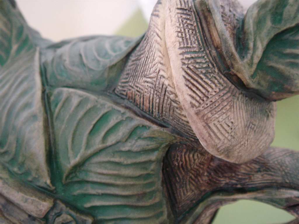
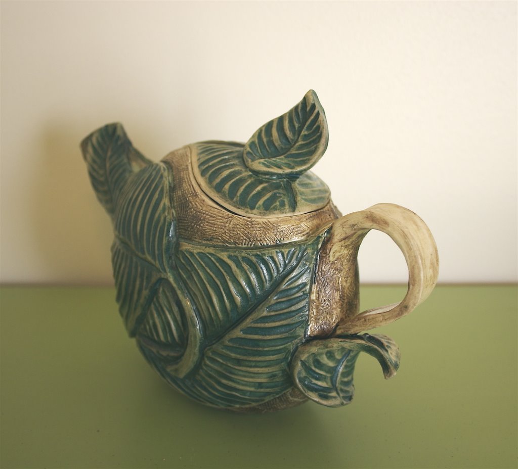
Choosing some less-favorite pieces, I tested out this new combination. They turned out all right, but the green still needed more of a pop. After thinking things over for a day or so, I decided to tweak things a little. I would still use red iron oxide with no additives, but instead of using straight Florentine, I would add a little bit of glaze. After applying the oxide and the stain/glaze, I would brush the entire thing with a thin wash of clear glaze. I bravely applied this combination to four of my pots, and surrendered them to the caprice of the kiln. Twelve hours later, the kiln was opened. I was very excited by what I saw. Florentine Green came out a dark, clear green with no sign of dustiness. The brown of the red iron oxide contrasted well with the green. The wash of gaze gave the pieces a light overall sheen that unified the two colors. Below is detail from and a picture of a teapot from that first successful batch.


With this success, I finally feel able to glaze the rest of the bisque ware from the past few months sitting in my garage. Wish me luck!


Tuesday, March 07, 2006

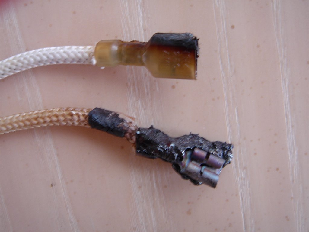
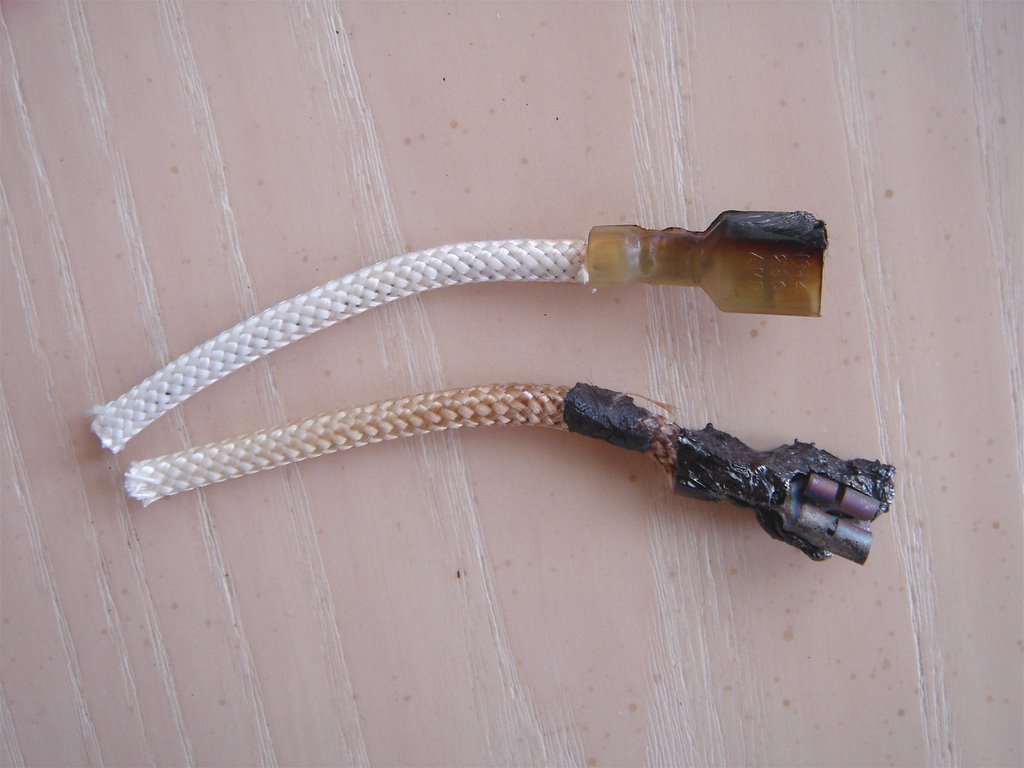
What was wrong with my Kiln...After opening the bowels of my kiln, it's no longer a wonder that it wouldn't reach cone 10. It's a wonder that the kiln even worked at all. Pictured above are the connectors to the number one and two relays. Obviously, there was something wrong with them. They were frizzle-fried to a crisp. However, after speaking for some time with the repair-man and the kiln company, we decided that it wasn't the relays that were at fault; it was the control box itself that had shorted them out.
The kiln company sent me a new box to use while they fixed up the old one. I had to strip back the wires and put on new connectors, but once I re-attached everything to the new box, the kiln worked great. It fired up to cone 10 without a hitch.
I'm back in business.

Thursday, February 23, 2006

Kiln Woes

Cone 10 is the magical number--the point at which the stoneware I use vitrifies. Reach cone 10, and a pot becomes dishwasher, microwave, and oven-safe.

After bisque-firing beautifully load after load of leaf pots, I was ready to do some glazing. I did several test tiles, and tried out some stains on a couple of my least favorite pots. I switched on my electric kiln to a medium speed cone 10 cycle. 16 hours later, my kiln puttered along at 2000 degrees for a while before finally giving up and flashing an error signal.
I called a technician at the kiln company who promised to call someone here in Utah to have them come check out the kiln. That was yesterday.
Now I wait.

Thursday, February 02, 2006

Favorite Reads-- 2005

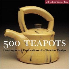
500 Teapots

I was introduced to the "500" Lark pottery series this year. So far, I have purchased 500 Teapots and 500 Cups. Both are excellent. There is no text, only captions with the title, artist, dimensions, year, construction process, and occasionally a short statement about the work. The lack of commentary frees the reader to make his or her own interpretations of the work. I love the amazing range of styles and processes represented. It is inspiring to see the many different artist interpretations of one form. Whenever stuck for ideas or craving inspiration, I can pick up one of these books, open at random, and browse through the excellent photos.

Other works in this series include, 500 Cups, 500 Figures in Clay, and ready for pre-order, 500 Pitchers

Wednesday, January 25, 2006

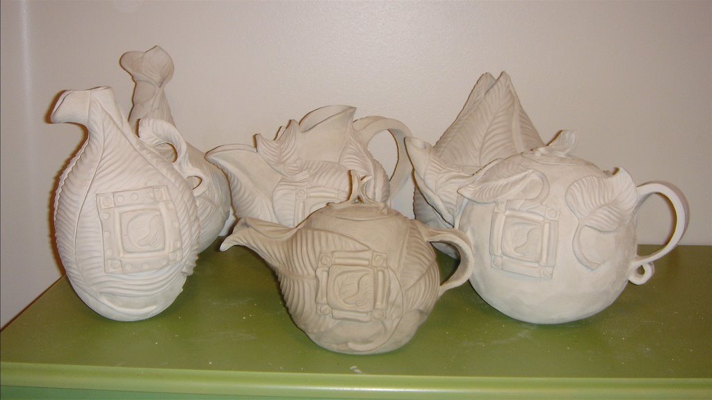
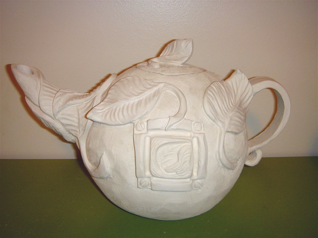
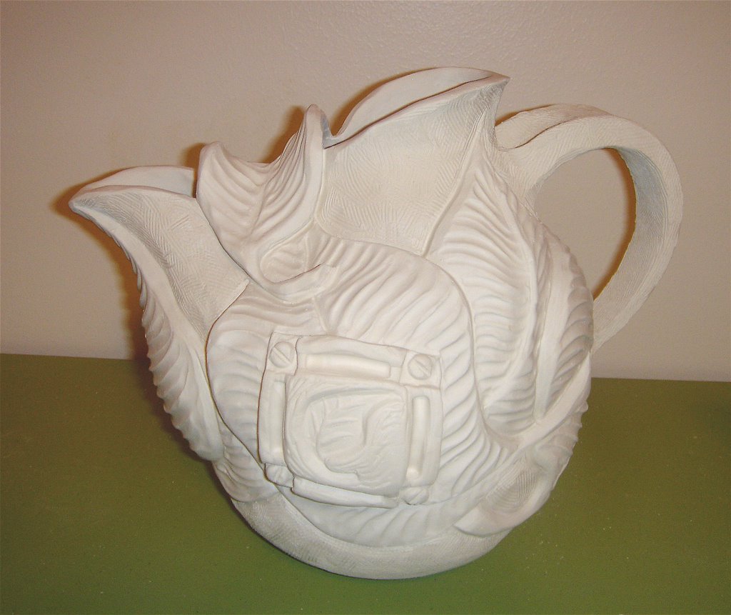
Variations on a Leaf


I've been working on a new series of pots centered on the theme of leaves. The pots haven't been bisqued or glazed yet, but here are some examples of my work.


Friday, January 06, 2006

Unconventional Alternatives to Glazing

Traditionally, ceramic ware is finished in the flames. Whether decorated with smoke, slip, terra sigilata, oxides, or glaze, the final step in a pot is surrender to the fire. A potter offers his or her individual oblations to the fire god, fate, luck, or what have you, and places the pot in the kiln. Hours later, the pot re-emerges--beautiful, horrid, or something in between.

Potters have come to prize this co-creation with fire. The spontaneity and combination of pleasure and pain is akin to the relationship between lovers. Through time and struggle, a potter may come to know the firing and adjust to its individual quirks much as a lover will grow to better understand his mate. Yet, there is always an element of surprise. For better or worse, the flame will leave its individual mark on the pot.

To forego this passage by fire and simply apply paint to the surface of the pot may seem to some to be a form of sacrilege. However, in recent years, alternatives to glazing have become somewhat more accepted. In the January 2006 issue of Ceramics Monthly the "Monthly Methods" article is entitled, "Chadbourne's Color: Paint, Glaze. Indoor, Outdoor." (Pg. 63). Although his outdoor work is glazed to outlast the elements, Chadbourne's indoor pieces are painted. The article outlines his process of painting with acrylics, sanding, and staining with acrylic washes.

While the vast majority of my work is still glazed, smoked, or raku'd, I enjoy the added possibility and challenge of finishing works with paint. It has the advantage of being more controllable while still allowing for an organic look. One is not limited to the earthier palette of high-fire glazes. The sky is the limit for coloring and color combinations. The finished look tends to be thinner and less "substantial" than glaze. Below are some examples of various methods of using paint. Each form has a description of what paints and steps were used.


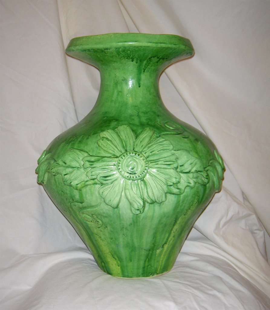
This pot was painted with a basecoat of off-white acrylic paint. It was then sprayed with very thin yellow, and then successively thicker layers of green, only allowing each layer to dry slightly before applying the next, giving the pot a very fluid finish.


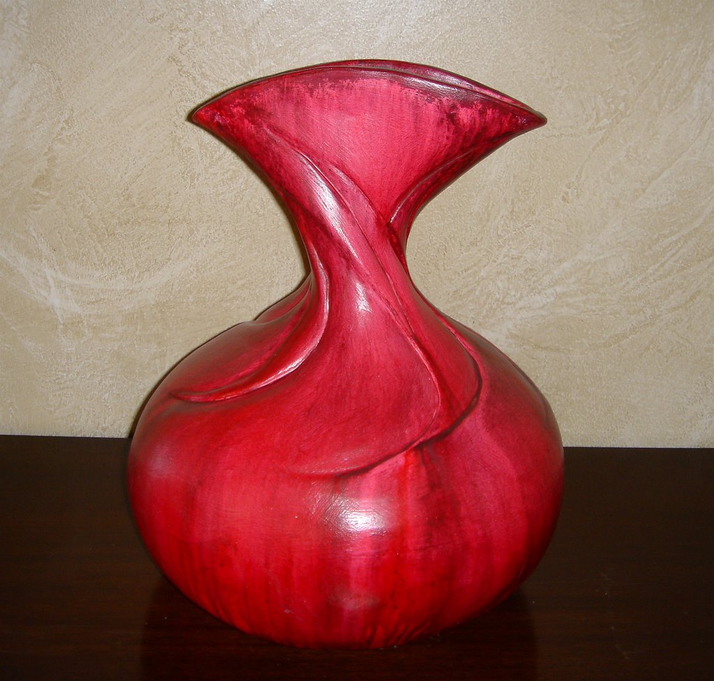
This vase was sprayed and poured with pink and red thinned-down acrylic paint. On top of this was sprayed a thin layer of black with a little red mixed in. After the black partially dried, the whole pot was sprayed with pure water. The water caused the interesting texture at the top and the fluidity at the bottom. After everything dried, the whole pot was sprayed with a thinned-down shiny varnish.


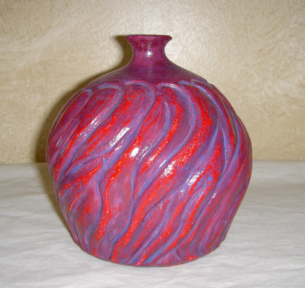
The finish on this bottle was created with acrylic paint. First, a layer of solid red was applied. After this dried, a wash of purple was added, allowed to dry a little, and then rubbed off with a paper towel. A very watered down layer of blue was added to the cracks and also partially rubbed off. The whole thing was then coated with a clear sealant.


This pitcher was sponged and brushed with blue and blue-green watercolor. After the watercolor dried, it was coated with a clear varnish, which was also allowed to dry. A black acrylic was applied on top of the varnish. After the black dried, a last coat of clear varnish was added.


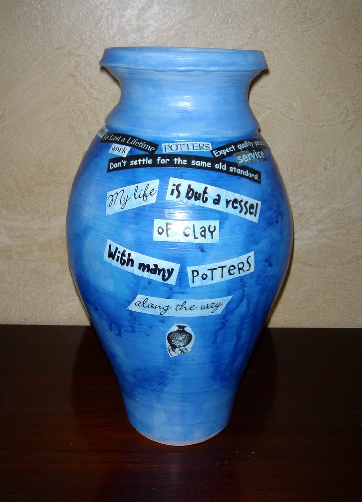
This vase was covered in thin, blue, watercolor and then sealed with Mod Podge. Thicker blue watercolor was painted on in swirls and blown on to bleed out the color. Cutouts from magazines and some printed text were Mod Podged on to the pot collage style. The whole pot was given another coating of thin blue and topped off with Mod Podge.


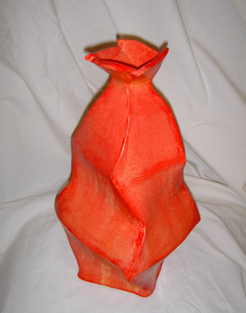
This vase was base-coated with an off-white acrylic. It was alternately sprayed and poured with yellow, orange, and red acrylic washes. The edges all received a coat of thick red acrylic that was partially wiped off. The whole pot was coated with a clear satin varnish.


This vase was base-coated with a cream colored acrylic. It was sprayed very unevenly with oranges and reds at the top of the form to allow dripping at the bottom. Before the paint completely dried, the top was washed off partially under the sink with a sponge, allowing the carved texture to show. When dry, the whole form received a coat of semi-gloss varnish.

Monday, January 02, 2006

Christmas Cookies and Holiday Hearts

Ceramic Christmas Tree Ornaments


There are many very artistic, challenging, and intelligent ways to use clay to make meaningful holiday ornaments. This is not one of them.

My husband and I didn't have very many ornaments to begin with--a couple of small, hanging picture frames, a "First-Christmas-as-a-couple" trinket from my parents, and some ribbon and bows. For our first Christmas in our new home last year, we "upgraded" to a full size Christmas tree. In making the switch to a larger tree, quantity in ornaments was valued over quality. So these cookie-cutter (literally) Christmas ornaments are not for the artist searching for deep expression and meaning; they are for the monetarily challenged ceramic artist who does not wish to settle for plastic balls.

These ornaments require very little supplies and not much time commitment in the early stages. The entire project can be explained in four steps: Roll out slabs of clay. Cut desired shapes from the slabs. Bisque fire. Paint and decorate as desired. Not much to it. It's so easy that I've actually done something similar with a first grade class. Where this project becomes interesting and fun for me is in painting and decorating. I have my own process that I like to do, but really the possibilities are endless.


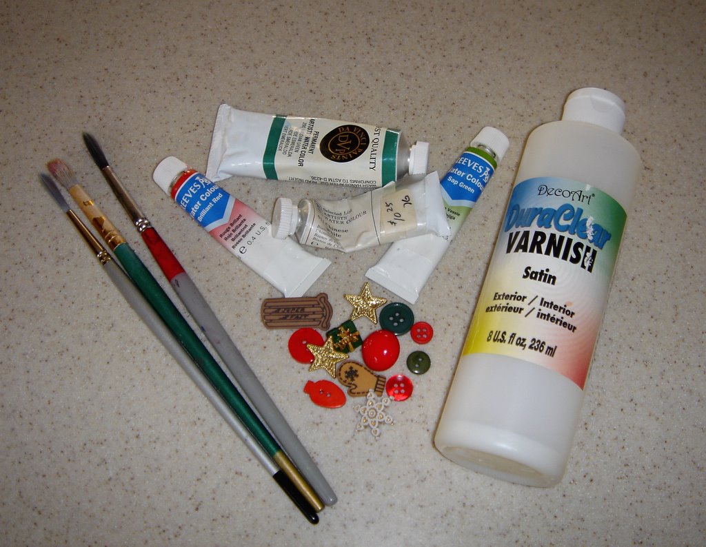
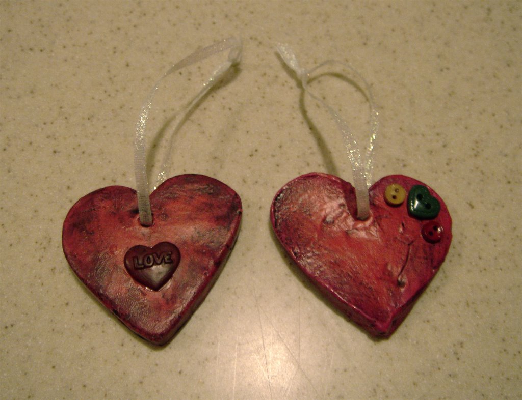
Above are some possible decoration supplies: paintbrushes, various watercolor paints, holiday buttons, and clear varnish.


Watercolor paints create interesting effects on bisqued clay. Because the clay is so starved for moisture, it will suck up the water in the paint very quickly. This makes the application always thicker at the beginning of a paintbrush stroke. I like to use the thick/thin effect of the paint as a part of my design.


After a first coat of paint, the ornaments get a coating of clear satin varnish. This seals the first layer of colors so they won't mix with further layers. Once the varnish dries, I add a wash of black paint. After allowing the black wash to dry only partially, I blot it with a paper towel giving the ornament an aged look. Depending on how creative I get, and how many layers I paint, finishing the ornaments can honestly take forever. I tend to get carried away. Over a year later, I still have unpainted ornaments that I pull every once and while to work on.

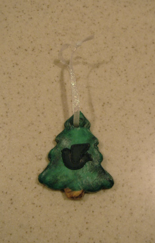
With a stroke of luck, when I was at the craft store buying ribbon to hang the ornaments on, I happened to see a bag of assorted holiday buttons. I bought them, took them home, and glued them on my ornaments. Voila!--finished holiday decorations.

My husband and I treasure being able to put things on our Christmas tree that are uniquely ours. Though our ornaments may not be the most artistic, they are meaningful to us because they are so personal. Each one represents time and talent given to make our house a home. I look forward to making another batch with my daughter. I just have to wait until she's old enough to hold a paintbrush.

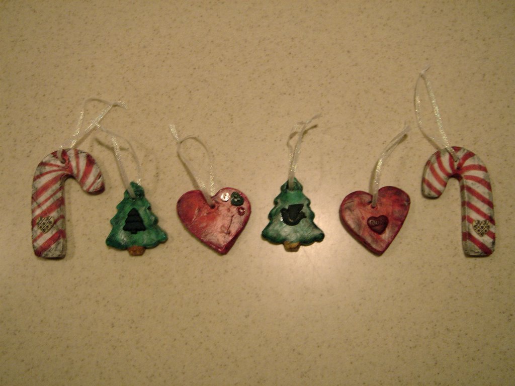
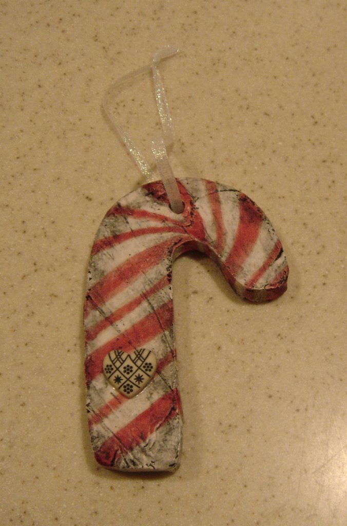
Below are some examples of finished ornaments.


Merry Christmas, Happy Holidays, and the very best wishes for this brand New Year from my family to yours!

Tuesday, December 20, 2005


Creating Indoor Fountains


Over the last month, I have been experimenting with making indoor fountains from handbuilt components.

The idea to try fountain-making in the first place came from a picture that I saw of an amazing teapot fountain by Gary Merkel, simply entitled "Tea Pot". The fountain was displayed in
The Ceramic Spectrum, by Robin Hopper on page 45.
Some more of Gary Merkel's work can be seen at
A Show of Hands Gallery

To help me get started, I bought an informational book on indoor fountains called Create Your Own Tabletop Fountains by Paris Mannion. The book had the information that I needed to get started, but there was more feel-good mystic material than I felt necessary (i.e.: how an indoor fountain will increase the positive chi in your home). However, I would still highly recommend getting this book, or any other reference to those who are entirely new to fountain-making. I had no idea what kind of pumps, tubing, and glue to even look for. The book was a place to springboard off of.

After having made these fountains, there were a lot of things that I would have done differently in the development stage but did not find out until I was trying to assemble the finished product. Instead of a how-to format for this article, I have decided to take a much less formal “What worked—and what didn’t” approach. I hope this proves useful to others trying to create their own ceramic fountains.


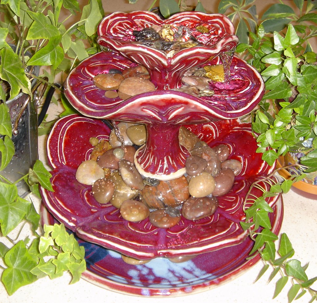
Three Bowl Fountain


What worked?

• The top bowl had the perfect spout shapes on the sides from which to pour into the other bowls.
• Placing a long foot on the bottom of the bowls, rather than trying to come up from the bottom of the next lower bowl proved useful for glazing purposes.
• The straight up-and-down design with the continuous line from feet to bowl provided easy placement of the tubing for least exposure.

What didn’t
• I didn’t think hard enough about where the pump would be going—hence the huge pile of rocks in the bottom bowl to cover it up. I’m not sure that the river rocks completely match the style, carving, and coloring of the bowls. Next time, I would have either made the foot of the bowl above large enough to accommodate the pump, or made and glazed smaller stylized pieces of clay to replace the river rocks.
• The middle bowl does not have any clear channel for the water in which to run, so it tends to pour and splatter from everywhere. Next time, I would try to design it with definite spouts on the edges.
• I would have liked the bottom bowl to be larger. This would give more space to hold water in the bottom, and might look a little more balanced. In order to give the fountain enough water to supply all of the bowls, more water must be added as soon as it is turned on and the original water is sucked up the tube.


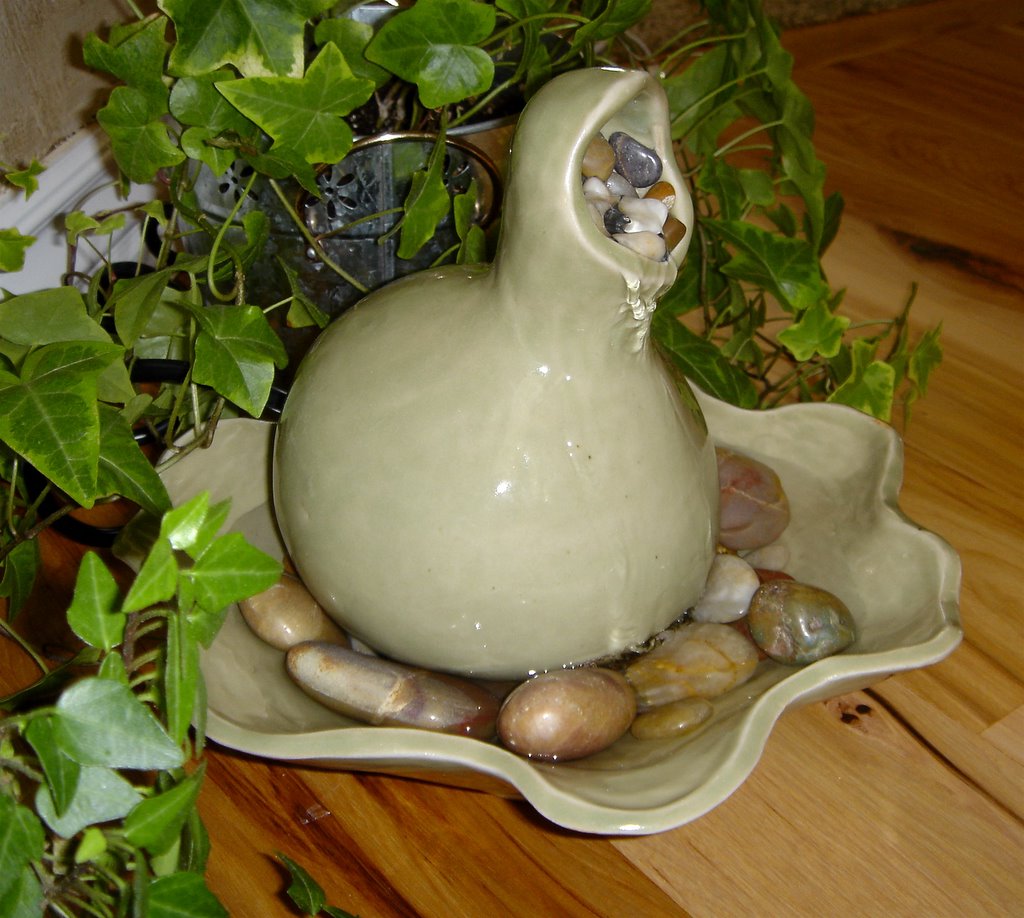
Gourd Fountain


What worked?
• The simplistic design and minimal components of this fountain made it much easier to put together and much less fuss to work with.
• The glaze coloring (a green celadon) and the rounded form work well with the smooth river rocks.
• When I created the top component, I left a large hole in the bottom. This hole allows quick and easy access to the pump and the tubing. The form just sits slightly on top of the pump itself, supported by the river rocks.

What didn’t
• The hole around the top of the gourd was very difficult to position with rocks in such a way that they didn’t fall down the tubing, or simply through the form. I finally worked through this problem by gluing some larger rocks around the tube, and then gluing smaller ones on top of it. It was especially difficult to make the rocks work because I couldn’t immediately test how they affected the flow without destroying my glue job.
• The thick black cord seems disproportionate with the rest of the fountain. In the future, I would look around more to find a pump with a two-prong cord instead of this massive three-prong one.

Sunday, December 11, 2005


Flat Bisque Stamps


Flat stamps are similar in form to rubber crafting stamps. However, instead of creating a simple space/negative space two-toned image, flat bisque stamps go so much further. They can create depth and texture on the clay to make a truly three-dimensional image.

1. Roll out a ¼ inch thick slab, keeping the thickness even throughout.

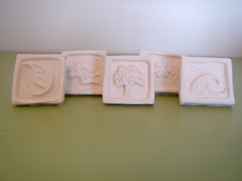
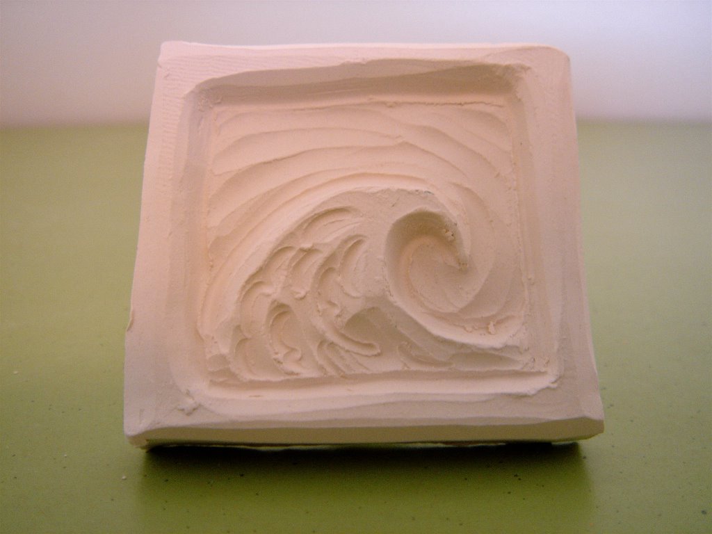
2. Cut the stamp shape from the slab using an exacto knife or a needle tool. Stamps may be any size or shape (within reason). When designing the outer shape of the stamp, simpler is better for cutting out and cleaning up. To save myself trouble when making a very complex stamp, I will surround it by a simple square or round border. As in the stamp pictured below, the wave shape would be hard to cut out an brittle at the edge. By giving it a square border, the stamp is more stable and even the negative space can be used as a design element.


3. From the same slab, cut out a rectangular piece to use as a handle for the stamp. The size of your handle will vary with proportion to the stamp. Score and slip the bottom edge of the handle as well as the contact point on the back of the stamp. Firmly press the handle onto the stamp, wiggling it a little to assure that it sticks. At this point, I like to grasp the handle with my thumb and forefinger on the front and back and press slightly, leaving an indentation. This makes the stamp more comfortable for me to hold when bisqued.


4. Lightly drape the stamp with plastic and allow to dry to medium leather hard.

5. When leather hard, clean up the back of the stamp. Run the eraser end of a pencil along the edges where the handle is attached. This serves to both strengthen the bond, and get rid of messy and sharp edges.

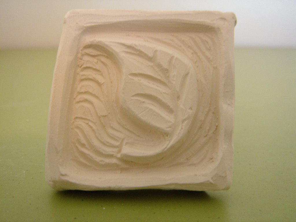
6. With a dull pencil or a needle tool, sketch the stamp’s details on the front. Using carving tools of your choice, carve and texture the stamp. The more texture included at this stage, the more interesting the indentation will be. As in the leaf stamp below, the background is also carved to create interest.


7. When the detailing is finished, allow the stamp to harden further to stiff leather hard. With a damp paintbrush or sponge, lightly brush all surfaces to eliminate sharp edges and give your stamp a finished look. Try to resist the overwhelming urge to test your stamp at this stage. I have broken stamps and destroyed carving in my eagerness to see what the finished product will do.

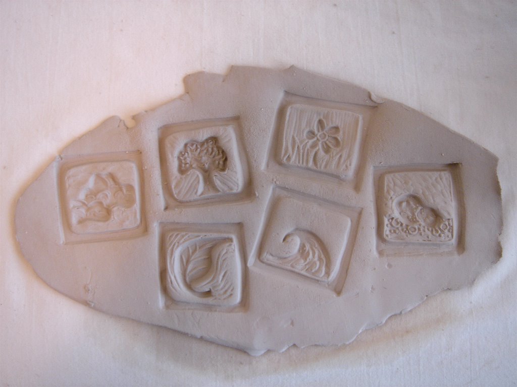
8. Bisque fire the stamp. All stamps shown are bisqued to cone 06 in an electric kiln. Below are some examples of indentations made by finished stamps.


Friday, December 09, 2005


Bisque Stamps


Creating and using bisque stamps is a unique way to make personalized impressions on ceramic ware.


Roller Bisque Stamps

1. Draw a design for the stamp on a piece of white computer paper, taking care that the end points on each side match up. When the paper is rolled up so that the ends meet, the drawing should create a continuous design. To help the ends meet exactly, I will often fold the paper into quarters lengthwise and use the half or quarter marks as starting and ending points. Below is an example of a roller stamp pattern.


2. Roll out an even, thick coil of clay, making sure that it is thick long enough to fit the pattern. Wrap the pattern around the coil, using pushpins to fasten it in place. With a wire tool, trim off the excess clay at each end. With a pen or a very dull pencil, trace your pattern. The impression from the tracing will serve as an outline for carving.


3. Using the traced outline, carve out the stamp. Many different tools may be used. I personally prefer a sharpened paintbrush end, a broken hack-saw blade, and two very old Kemper wire carving tools given to me by a friend. Keep in mind that the carved stamp will become the negative of the actual impression made in the clay. Where the stamp is carved inward is where the impression will be raised up.

4. Several smaller, less detailed stamps can be made by slicing the extra coil into round peices and then texturing the outer rims. I like to put random marks and carvings in these smaller stamps. In combination with larger stamps, they make excellent borders.


5. When the stamps are finished, allow them to dry to leather hard. Gently remove the clay from the center of the stamp to create a hollow cylinder. It is important not to leave the stamp too thick, making an explosion in your kiln, or too thin, creating a weak and brittle stamp.

6. Bisque fire the stamps. All the stamps shown are bisqued to cone 06.
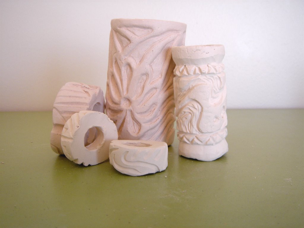
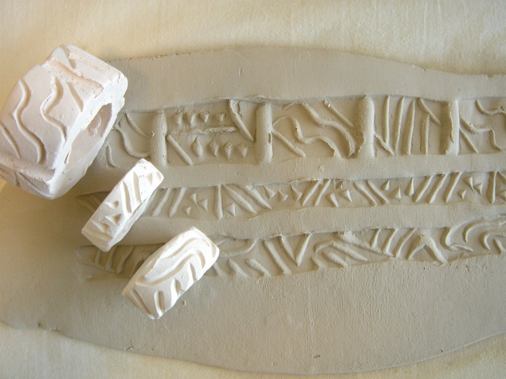
Below is the finished bisque stamp and what it looks like when rolled on a slab of clay.


A great informational article on how to make skinny roller bisque stamps can be found on the web at:
How to Make Ceramic Roller Stamps by Suzi Rhae
http://calstaging.bemidjistate.edu/en3930/rhae/howto.html